Well, Squiders, work continues apace on getting this novel ready for release in May. We’re finishing up our final revisions and the manuscript is due back to the copyeditor/proofreader in a few days. And now we have a title, so we can get going on our marketing.
So the next step is, of course, the cover.
I mean, ideally, we would have gotten started on the cover months ago. If you’re in charge of your own cover art, listen to me: GET THIS GOING EARLY. I like to do it at least six months out, normally, which gives you time to butt heads with the cover artist, get changes fixed, have a nice, well-marketed cover reveal (preferably linked to a pre-order), and not have to worry about things.
Six months ago we didn’t even have a first draft. I am learning all sorts of things about working to a deadline when there’s a year between concept and publication. Mostly things like This Is a Bad Idea and Oh God What Have I Gotten Myself Into. I’m not sure how people who put out a book or three a year do this.
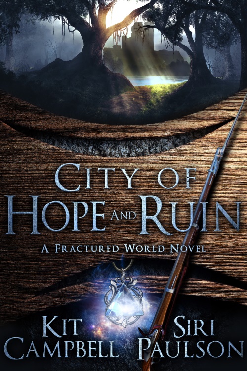
The nice thing about working with Turtleduck Press is that we have control over our own cover art, because I know that can be an issue at times. (I have a friend who recently had a historical fantasy novel traditionally published, and he says sales and reviews have been good, but he’s very disappointed in his cover art. He fought to get his main character on it and the publisher ignored him.) On the other hand, now we’ve got to figure it out ourselves. And not only does it have to be representative of this novel and portray the general tone and genre of the story, but it’s got to launch a shared world series, so it has to be in a style that subsequent books/novellas, etc. can follow.
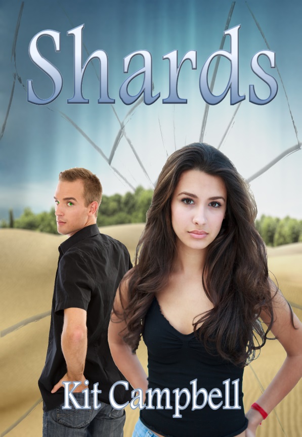
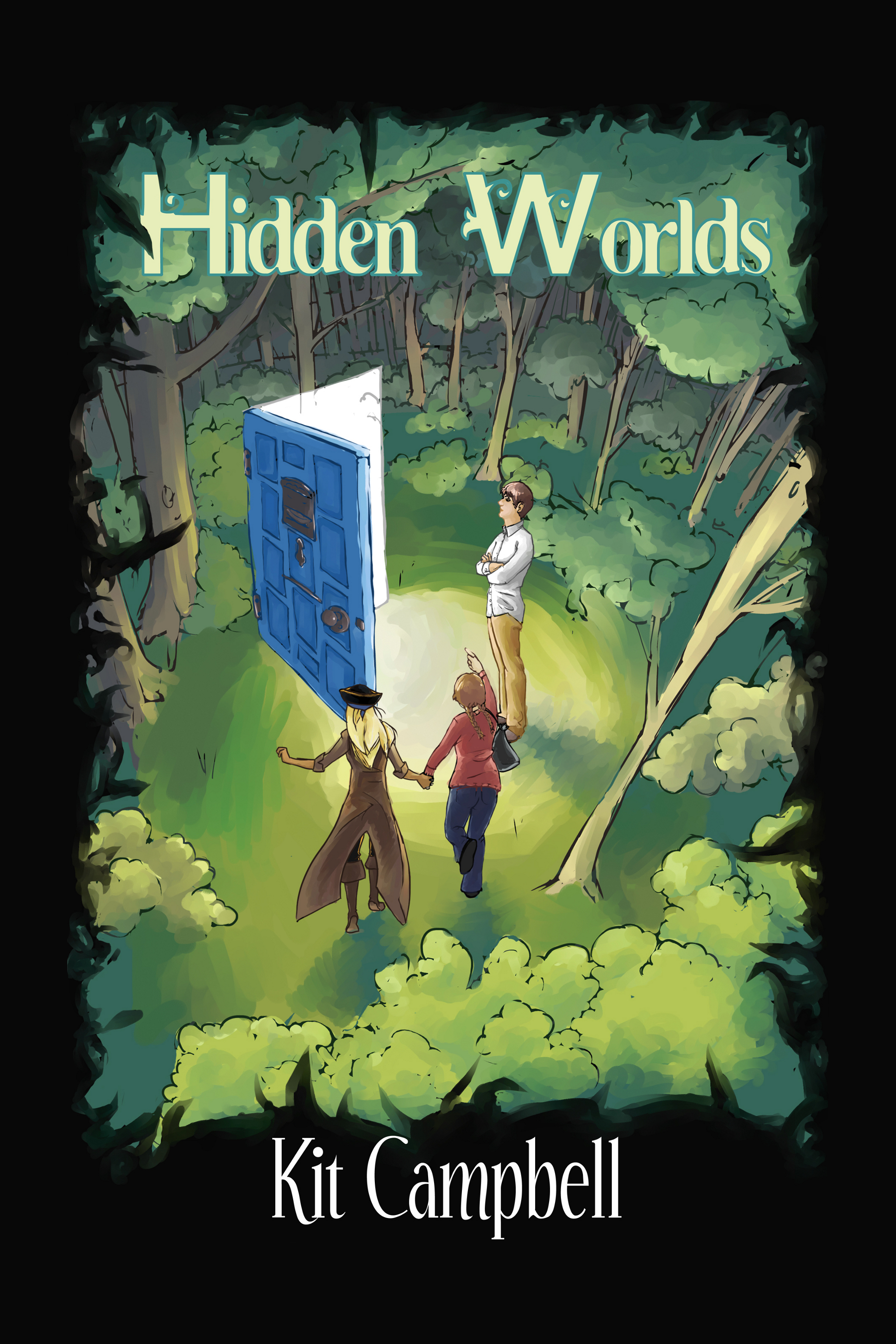
I feel like none of my previous books have been this hard. For Hidden Worlds the artist was a friend, and I just let her read the book and then come up with a cover. For Shards I had a clear idea what I wanted and what was usual for the urban fantasy/paranormal romance genre.
Here we’ve got high fantasy, which points more toward hand-drawn illustration, but we could also do something more symbolic.
Options, options, but we’ve got to get it figured out and done.
Any recs, Squiders? Thoughts on illustration vs symbols? Cover artists you’ve used that you like?
Covers are so important. I usually have an idea after I finish the first draft. Symbols can be awesome if they scream mystery to be solved by reading the book.
Cover concepts are hit or miss with me–sometimes I come out of a novel with one, sometimes not. I am not the most graphically astute person.
I think I’m a frustrated artist, and my site shows that. I can’t draw a crooked line, but have a decent idea what works. I struggle with titles though.
Titles! Bane of my existence.
I think the symbols thing is what’s trendy right now, and there is something to be said for a nice, clean, minimalist design. Look at the Hunger Games books. A series I enjoyed, Garth Nix’s “Sabriel,” were re-issued with more logo-like covers.
Hm, that’s a good point.